After publishing my website a lot of friends and family asked me why I did choose those "ugly" colors. They said the website is "moltey" and the colors "do not match". I like those colors but I also want that my visitors are not bothered by my sense of beauty. So let me try to explain what's probably wrong with those colors.
First things first, I am one of 6% of the male population with red-green color anomaly better known as Deuteranomaly. There are sufficient articles on the web about the human vision, the three classes of cones and all kinds of biological explanations about color blindness:
- A pretty good article about design for better color accessibility: http://blog.usabilla.com/how-to-design-for-color-blindness/
- Data visualization often confuses color-blind people: https://venngage.com/blog/color-blind-friendly-palette/
- Asana is a role model for user experience and accessibility: https://blog.asana.com/2017/01/new-accessibility-feature-colorblind-friendly/
For my website I choose the following color palette:
Colors
For finding this color scheme I used Adobe Color CC - formerly known as Kuler. I did not made any research on color theory or similar I just wanted colors I like. We have a blue, orange, pink and a light shade of grey and two main colors plain white and dark grey.
Perception
The following random generator paints how color perception could change. You can switch the anomaly to get a sense on different types of color blindness:
Code
I found the brilliant npm package color-blind by @skratchdot. The scripts emulate the 8 common types of color blindness by applying a confusion matrix to the RGB space.
To generate a random hex value we do some basic math. You can pick a value from 0 to 256 for each of the additive colors red, green and blue thus there are 256x256x256=16777216 possibilities for a RGB color. We multiply the number of combinations with a random number from 0 to 1, transform the numeric value to a base 16 representation and take just 6 positions, that's it:
By using a simple interval we generate a random hex value every second and pass it to the colorBlindFn function which takes the selected anomaly transformation of the color-blind library to calculate the corresponding color.
This is just a small calculated comparsion of regular and impaired vision but I hope people are able to emphatize with color blindness.
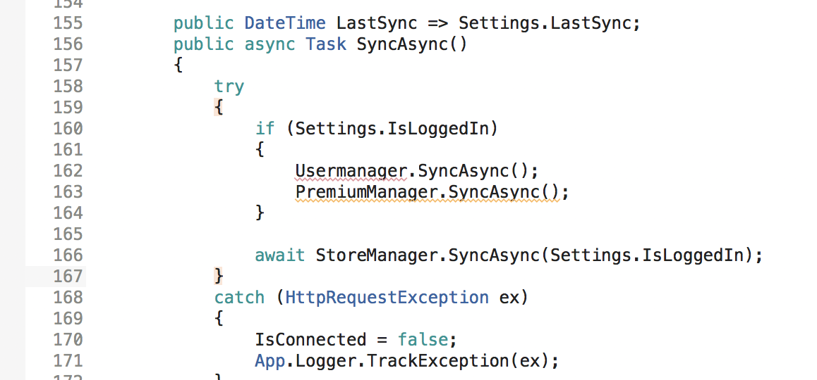
During writing this article I started realizing that there are a lot of situations where I'm not able to distinguish colors, e.g. it's pretty hard to see the difference in syntax highlighting of Visual Studio for Mac.

So I decided to start a collection of software, websites and stuff with a not-so-good color scheme and share them with you. Stay colorful!